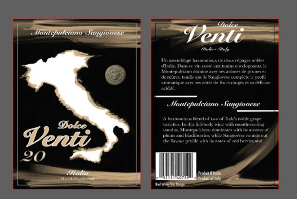
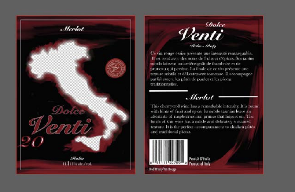
Dolce Venti
I designed this wine label in Adobe Illustrator, carefully handcrafting each background effect to create a unique and playful visual. I also explored transparency techniques to allow the design to interact seamlessly with the wine bottle, giving it a more dynamic and refined finish
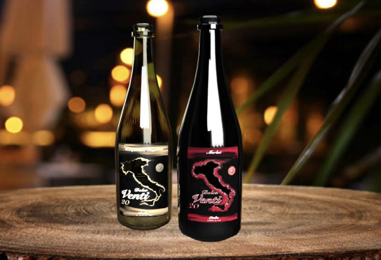
I chose to use the Italian symbol because the wine originates from Italy. I wanted to add a creative twist by making the shape of Italy visible inside the bottle. That’s why the interior of the country appears transparent through the bottle, allowing the design to connect the product to its origin. This creates a visually appealing and meaningful composition that highlights the wine’s Italian identity.
Challenge and Solution
Challenge
- Create a transparent Italy shape inside the wine bottle design
- Keep the design clean without making the label look too crowded
- Align the Italy shape correctly inside the bottle
- Make sure the design looks good on different screen sizes
Solution
- Used an SVG shape of Italy to keep the design sharp and scalable
- Applied opacity to create a transparent effect inside the bottle
- Used CSS positioning to properly place the Italy shape
- Tested the layout with responsive design techniques